Matching colours is not a trivial matter, especially when it comes to Interior Design and there is a specific science that indicates the rules for creating perfect combinations.
If you too are wondering how interior design professionals do not miss a match, read on and follow our blog for our professional advice.
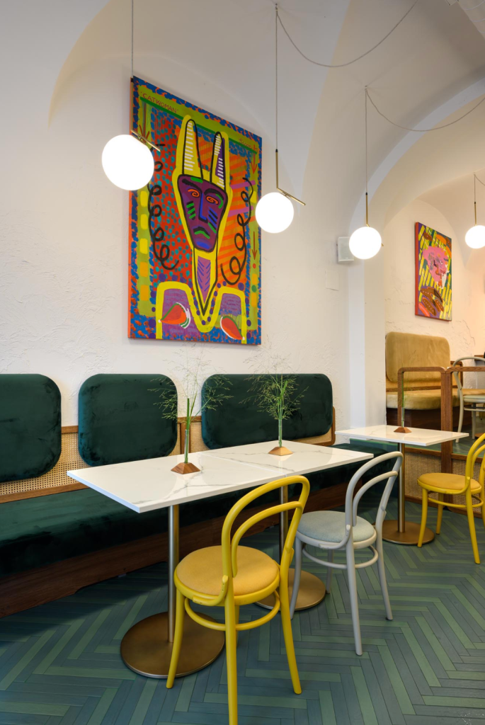
The use of color has the power to change the appearance of a room by adding depth and filling voids, creating verticality, when color is used to fill an entire wall from top to bottom. Last but not least, the color gives character and personalization to the spaces.
Not to be mistaken, professionals rely on the Color Circle, a very useful device that was developed by Johannes Itten. It helps us to match the colours which are divided into primary, secondary and tertiary. The primary colors are yellow, blue and red. By mixing them, you get the secondary colours, green, orange and purple. In the outer part of the circle we have the tertiary colours, which are the sum of the secondary and tertiary colours.
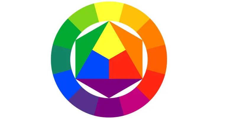
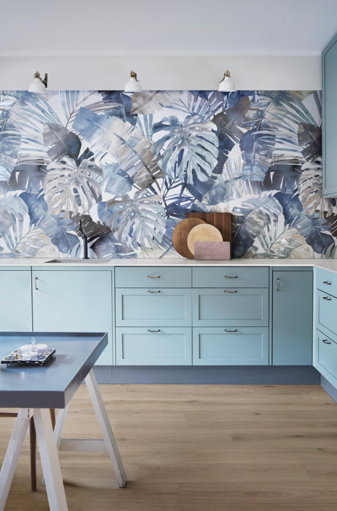
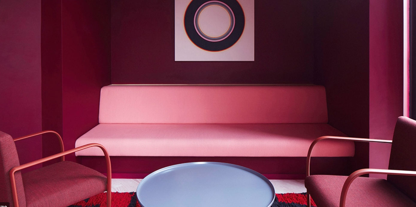
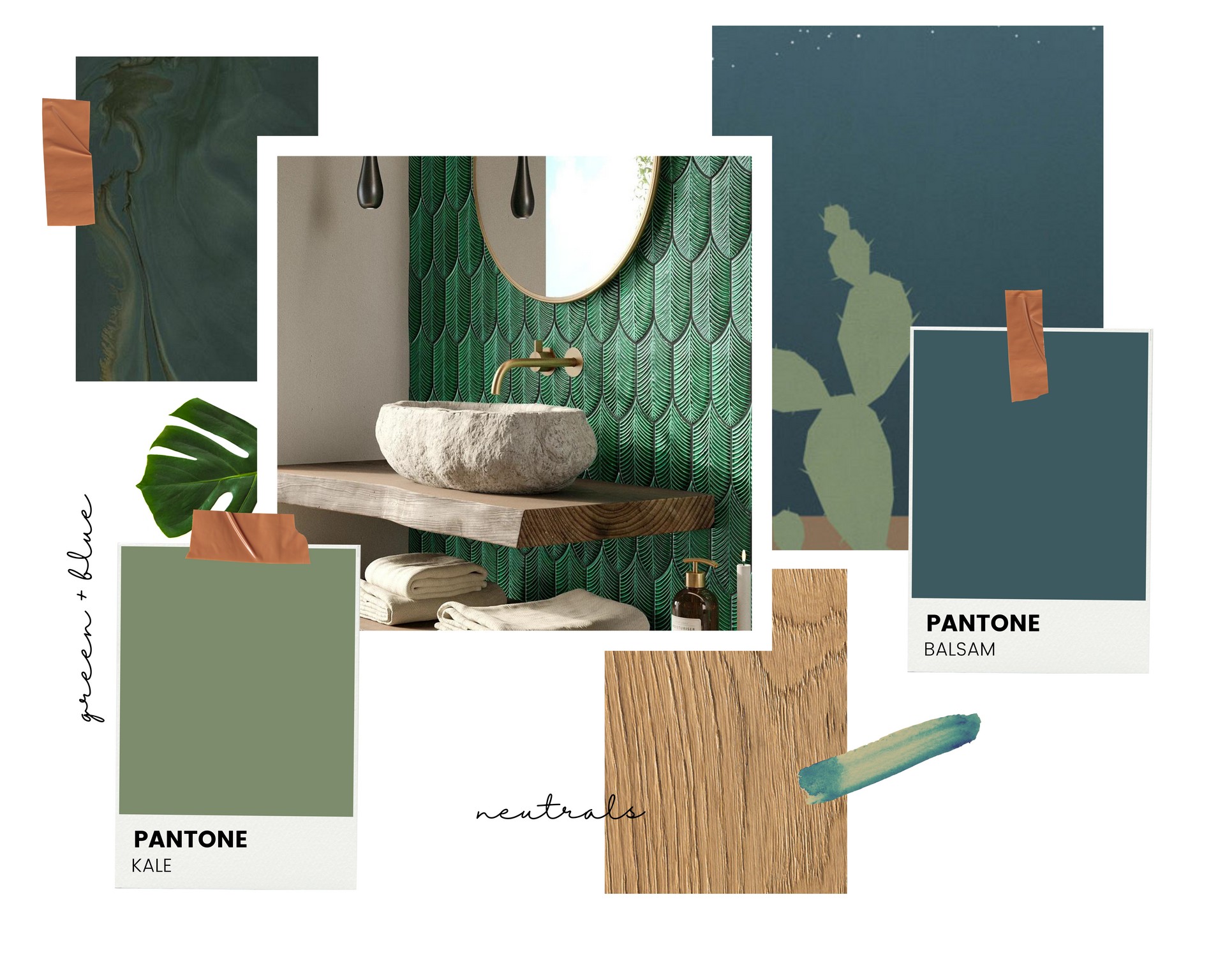
When we combine two or more colours, we must be clear about the effect we want to achieve: a contrast or a harmonious whole. To achieve a contrast we combine two complementary colours, those that have an opposite position on the Color Circle such as green and red, yellow and purple. On the contrary, to achieve balance and harmony we can combine similar colours that are in an adjacent position on the Color Circle, for example green and blue or yellow and green.
A very refined combination is the monochromatic one, which sees different shades of the same color side by side.

In the images we have some examples of realizations using porcelain stoneware floors and walls with complementary, analogous and monochromatic colors.
We will talk more about color on our Blog and we will tackle the themes of hue and saturation. Leave us a comment and keep following us for more tips.