
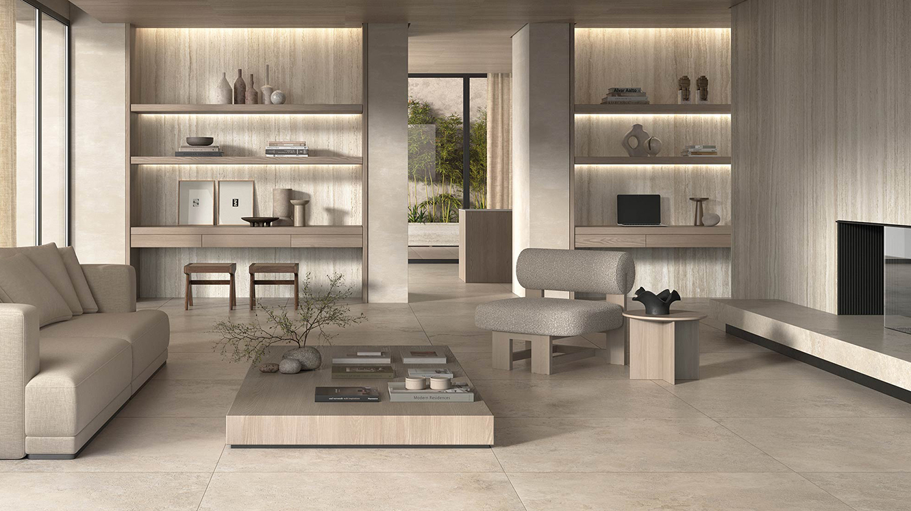
Cover image: A contemporary living room enhanced by the warm and natural tones of the Nativa collection by Kronos Ceramiche. The stone-effect porcelain surfaces create a harmonious, refined, and welcoming environment.
Discover the importance of neutral colors such as grey, taupe, and greige in interior design.
Explore how neutral tones can be used to create elegant, relaxing, and sophisticated spaces.
Grey: elegance and versatility in every shade
Grey goes beyond the concept of neutrality. With its various shades, it can range from a light grey that opens and brightens a space, to an anthracite grey that adds drama and depth. It’s perfect for those who want a calm base that highlights furnishings and decorative elements without overwhelming the eye.
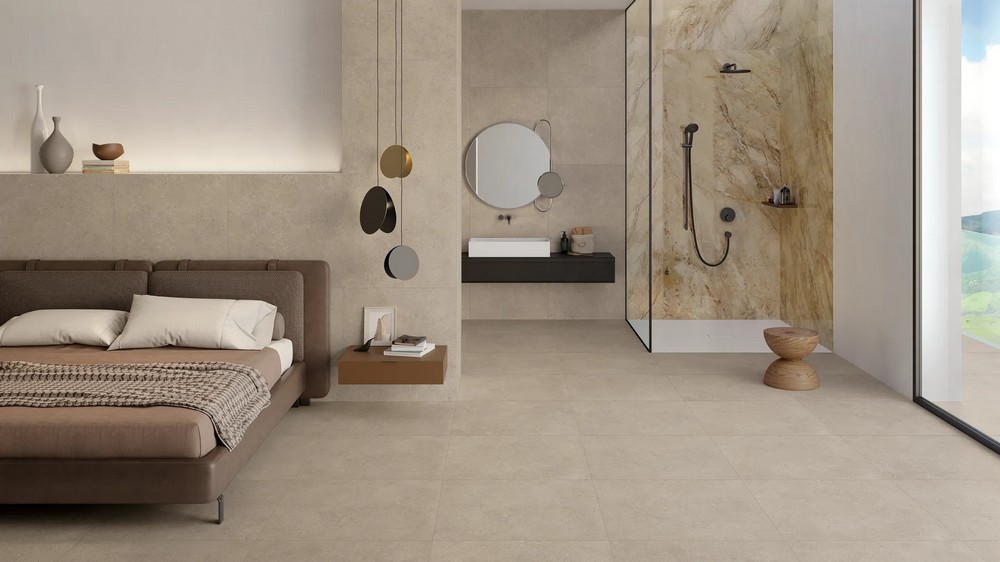
Taupe: refined warmth
If you’re looking to add a touch of warmth and coziness to your home, taupe may be the perfect choice. This neutral color, halfway between grey and beige, brings a sense of refinement and tranquility. It’s ideal for creating a comfortable space where guests instantly feel at ease.
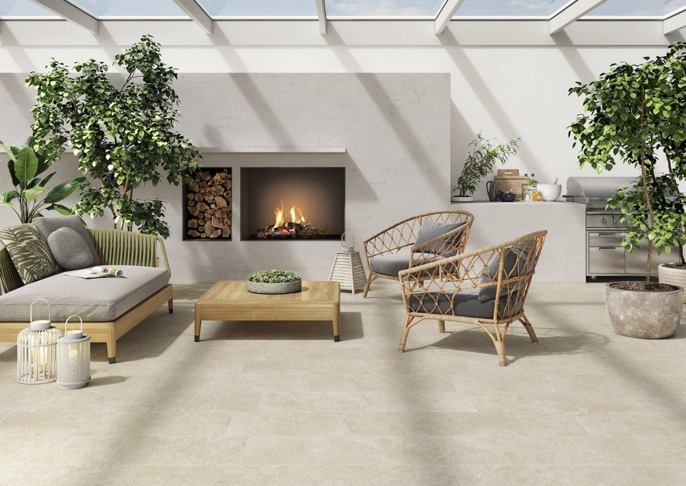
Greige: the perfect balance between warm and cool
For those who don’t want to choose between grey and beige, greige offers the ideal compromise. With its combination of freshness and warmth, greige adapts beautifully to any decor style, from modern to traditional. It’s a versatile color that can be used in every room of the house—from kitchen to living room—without ever tiring the eye.
The magic of neutral colors lies in their ability to adapt to a variety of contexts and personal tastes:
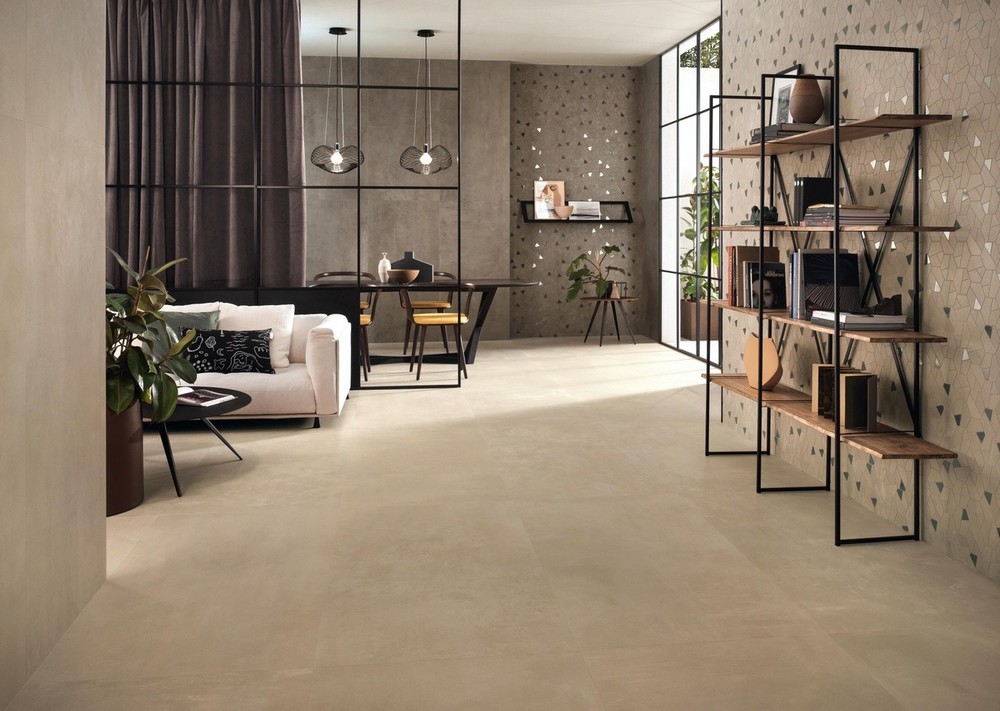
- Monochromatic harmony: Use different shades of the same neutral color to create a cohesive and relaxing space that’s never dull.
- Subtle contrast: Introduce vibrant colors or natural materials to create an elegant and dynamic contrast that adds interest to every room.
- Textures and materials: Don’t be afraid to play with different textures and materials. Wood, stone, and fabrics can visually enrich the space and add warmth and authenticity.
Beyond aesthetics: the benefits of neutral tones
Choosing neutral colors like grey, taupe, and greige for a project is a decision that goes beyond pure aesthetics. These tones not only create an elegant and sophisticated background but also a cozy and relaxing atmosphere. Experiment with different shades and combinations to discover how neutral colors can transform your space into something truly unique.
Explore our tile and surface collections to find the perfect inspiration and solutions for your next interior design project.