The rules for combining colors in interior design without making mistakes. Definitive guide to make the best use of the color circle and the different existing chromatic harmonies.
We talk again about color theory, a fascinating topic, and in particular about chromatic harmonies. This information is essential for interior designers when choosing finishes, furniture and curtains. Each of these choices will never be random but will be inserted into the project as a whole, following the chosen style and more specifically based on the color palette already defined for the project.
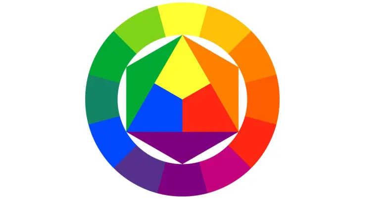
Chromatic harmony means an aesthetically pleasing and harmonious combination of colours, which is based on the color combinations on the color wheel, which we have already talked about in a previous post.
The Chromatic Circle
Let’s delve deeper into the topic and talk about how chromatic harmonies can be created using some schemes inherent to the chromatic circle.
Monochromatic harmony
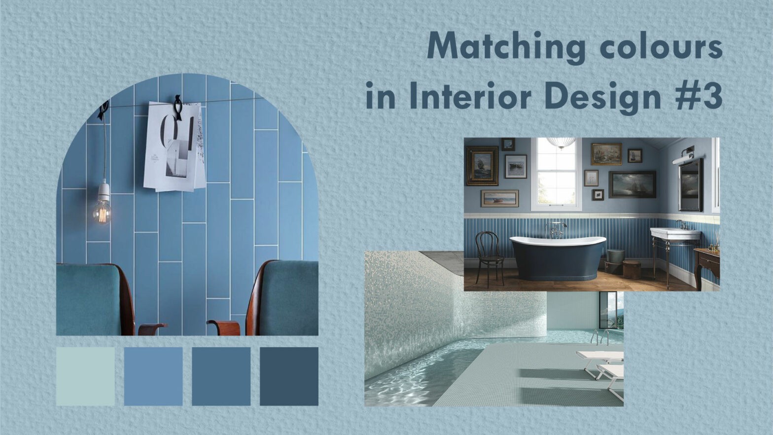
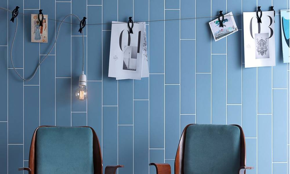
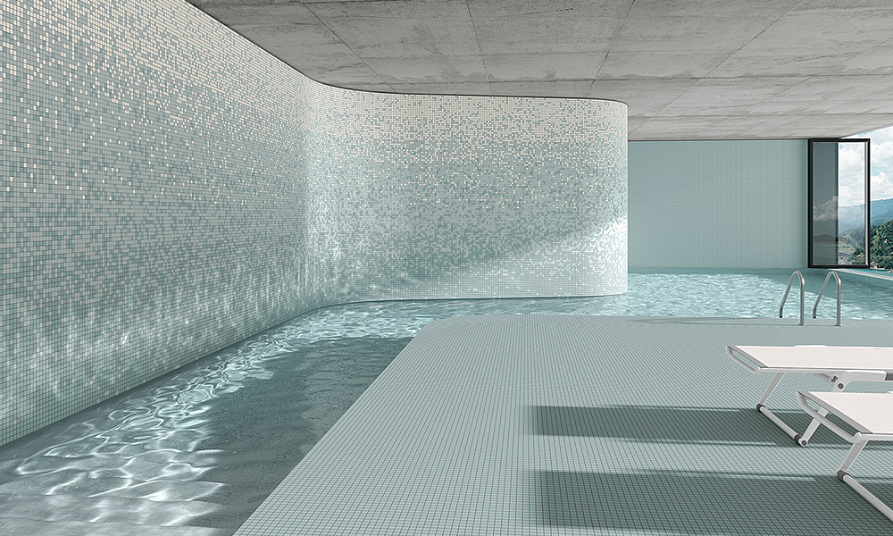
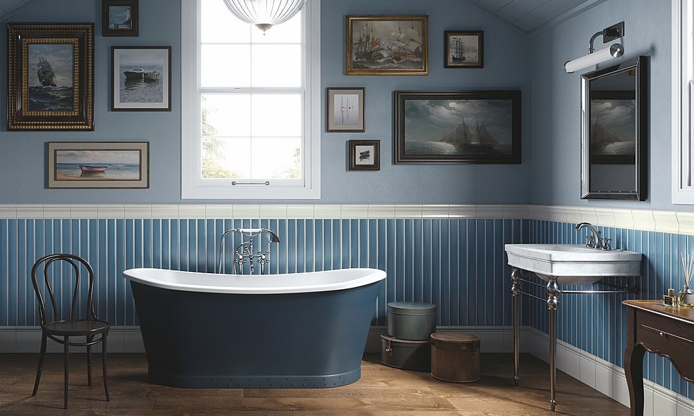
We have already talked about monochromatic harmony and how it uses a single shade but declined in different colours, tones and shades associated with that specific shade. A monochromatic harmony creates an aesthetically clean and simple palette and offers a great sense of uniformity. Example different shades of light blue and blue.
Harmonies with analogous color schemes
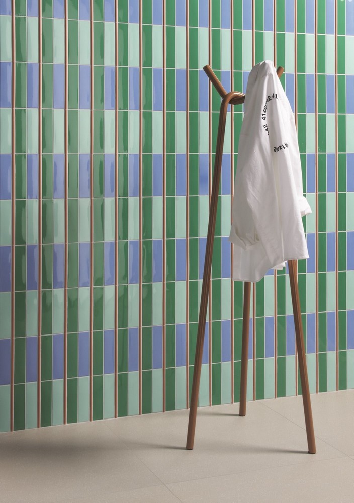
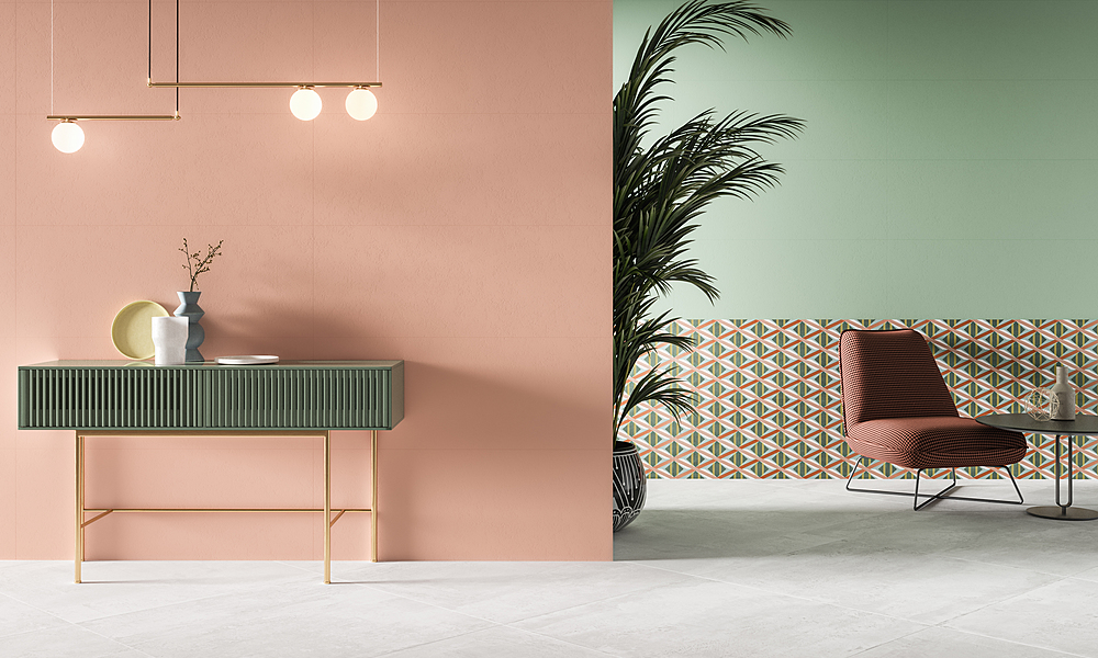
Analogous harmonic schemes involve the use of three or more shades, all positioned close to each other on the color circle. A three-colour harmony generally consists of a dominant color and a supporting color. The third color can be a mixture of the two previous colours or a contrasting accent color. Examples of similar colours: blue, light blue and green or purple, orange and red.
Harmonies with complementary colours
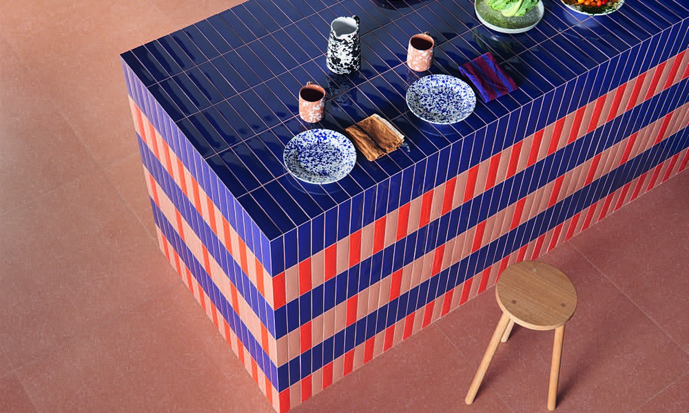
A complementary color scheme involves a pair of colours positioned at opposite points on the color wheel and can be primary, secondary or tertiary. This harmonious combination creates vibrant color palettes with great contrast. For example purple and yellow or green and red.
Equilateral or triadic harmonies
Triadic harmonies include three colours that are evenly spaced on the color circle. They create a very strong and vibrant color palette.