
Part 2
The combination of colours in interior design requires technical knowledge and a strong aesthetic sense.
The choice of materials and the related colour and texture palettes should not be neglected in the early stages of the project but is made in the initial design phase, so that the final result is coherent in all its aspects.
The pros rely on the Chromatic Circle, which we have already mentioned in the previous post (Go to the post “Match the colours in Interior Design part 1”). It is a device that was developed by Johannes Itten. It helps us to match colours which are divided into primary, secondary and tertiary. The primary colours are yellow, blue and red. By mixing them, you will have the secondary colours, green, orange and purple. At the outermost part of the circle we have the tertiary colours, which are the sum of the secondary and tertiary colours.
In this post we talk about how you can describe colour through the attributes of hue, brightness and saturation.
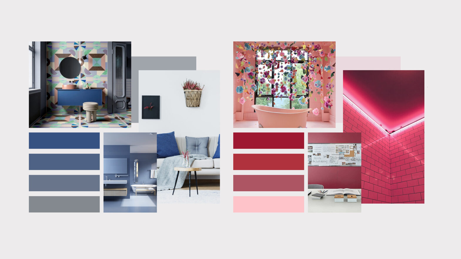
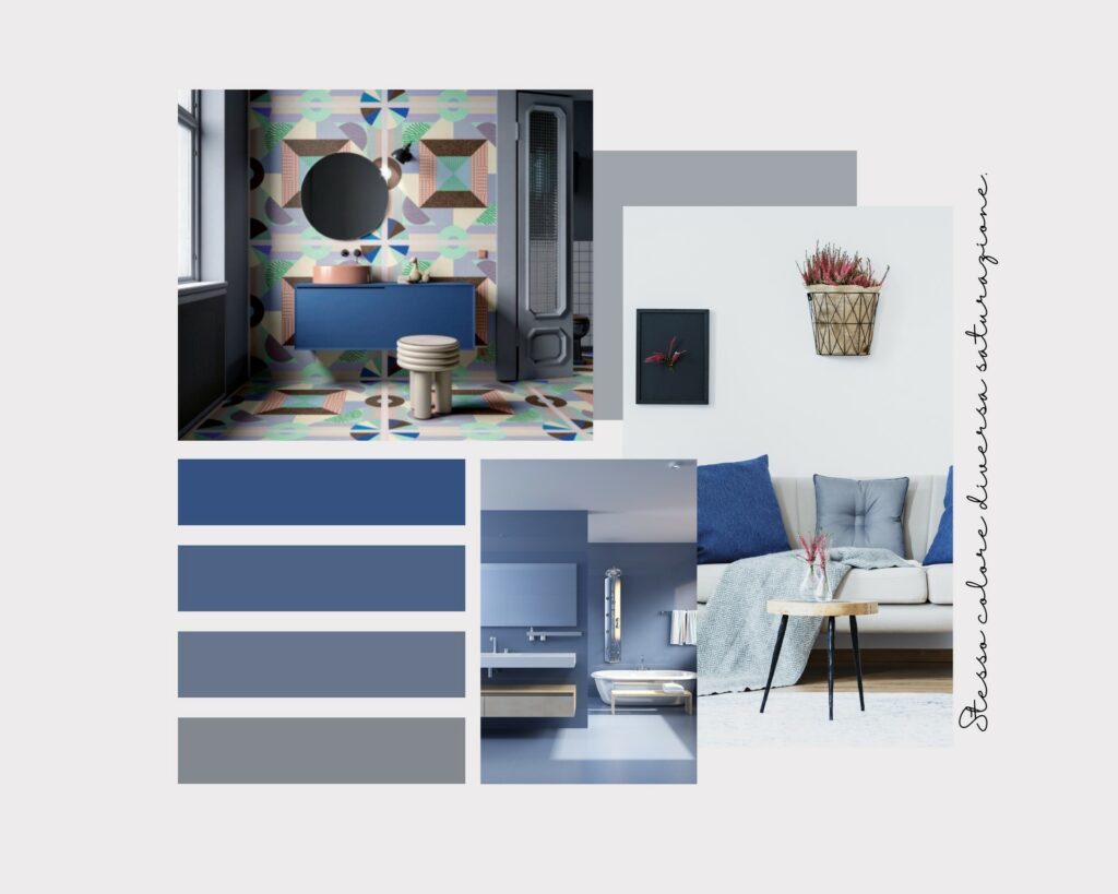
In color theory, the hue is the “pure” color perceived by the human visual system, or linked to a narrow spectrum or single emission line within the visible spectrum called optical spectrum. Red, green and yellow are examples of tints. The hues are sorted in the color wheel. In the moodboards presented, there is an example of different colours and different hues and of different colours and the same hue.
Brightness specifies the amount of white or black in the color. The most important brightness scale is the grey axis, that is the chromatic scale. In the moodboards you can find examples of different colours and the same brightness.
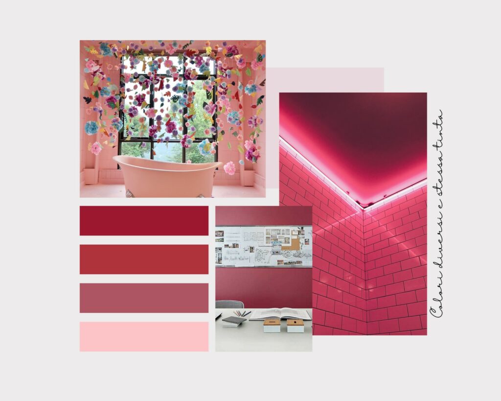
The third attribute of color is Saturation which is defined as the intensity of a color. A highly saturated tint has a bright, vivid color. As the saturation decreases, the color becomes more muted, dull, and greyish.
In the images we have some examples of creations using porcelain stoneware floors and walls by choosing different colours but the same tint.
We’ll still talk about color on our Blog and we’ll tackle other topics related to chromatic choices in interior design.
Leave us a comment and keep following us for more tips!