
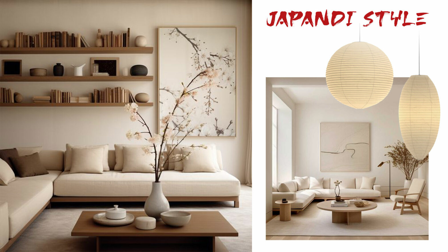
The Japandi style blends Japanese and Scandinavian styles. The finishes most suitable for this style.
Matching colours in Interior Design #3
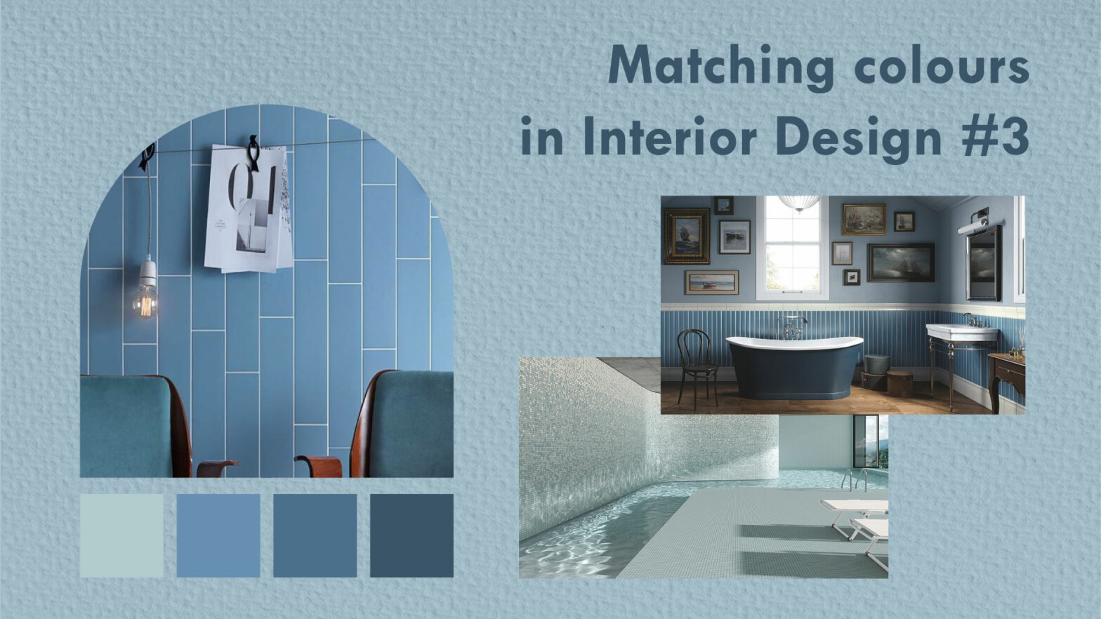
The rules for combining colors in interior design without making mistakes. Definitive guide to make the best use of the color circle and the different existing chromatic harmonies.
Ideas and suggestions for creating an accent wall that gives character to the living area and to the TV or fireplace wall.
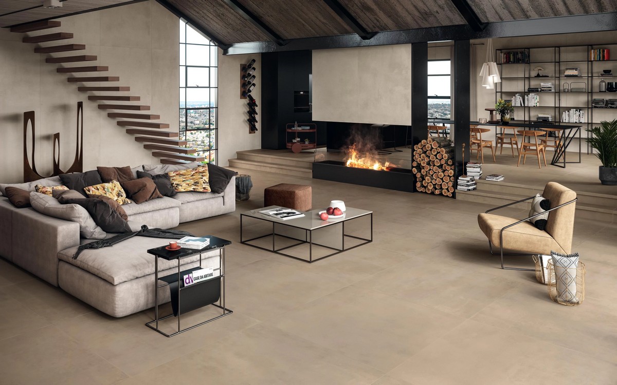
From stone to ceramic, from exposed brick to porcelain stoneware tiles. From neutral to more bold colours, but always suitable for the most sophisticated homes.
Enhance the environment with traditional tiles: the great return of cement tiles and grits
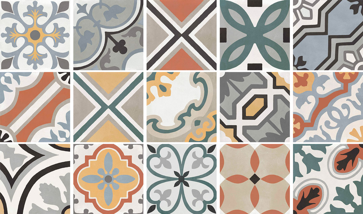
Renovate the kitchen or bathroom in a context of historical recovery, inserting decorated, original or porcelain stoneware carpets.
The choice between bath or shower
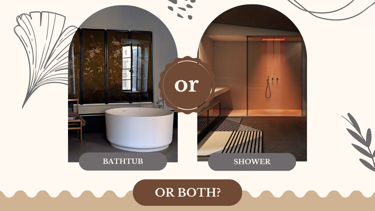
How to choose the most functional solution, considering the choice of bathtub, shower or a combination of them. The choice of coverings for the shower and the tub wall
Natural stone as a valuable element within the contemporary home
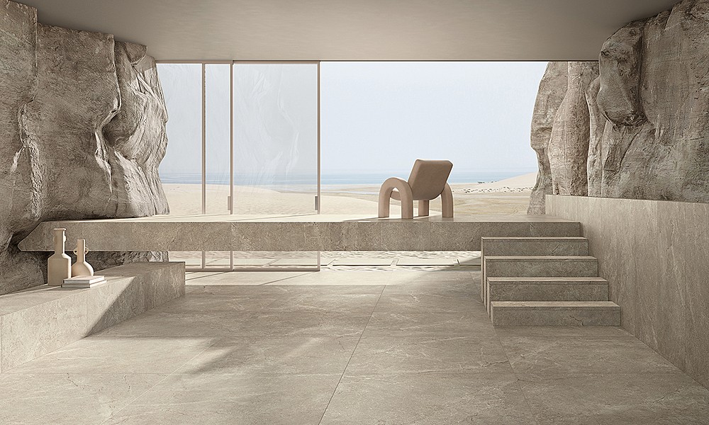
We are not looking for a rustic effect but for contemporaneity, elegance and limitless luxury. The porcelain stoneware alternative
Choosing tiles with natural, relaxing effects and in harmony with nature is the emerging trend in the world of ceramics.
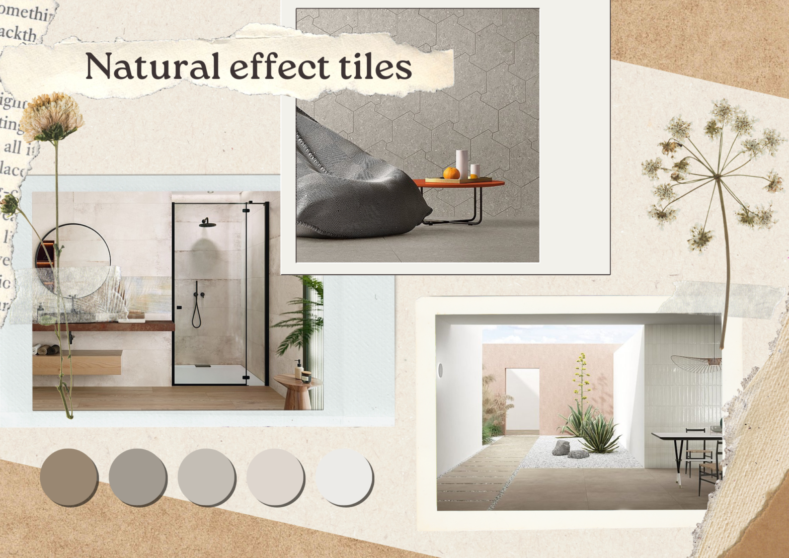
In the fast-paced era we live in, it is increasingly important to create a relaxing and harmonious environment in our home. Tiles with warm and neutral tones offer us a simple and effective way to transform spaces, giving a naturaltouch that allows us to rediscover a sense of tranquility and well-being.
Antiscratches and antistains materials for the kitchen and the bathroom
Which materials are best used to cover the bathroom and kitchen without having to worry about scratches and stains and which materials instead require more attention and care.
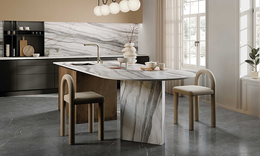
Design a five-star bathroom, thanks to the use of large marble-effect slabs.
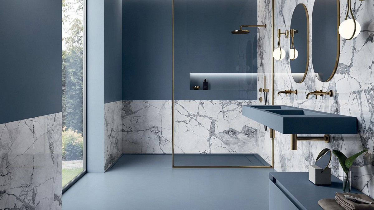
What does a guest expect when spending a night in a five-star hotel or vacation rental? Whether the trip is for work or leisure, after the comfort of the mattress, the element that makes us love or hate a hotel room is the bathroom!
A dream that comes true: an home SPA
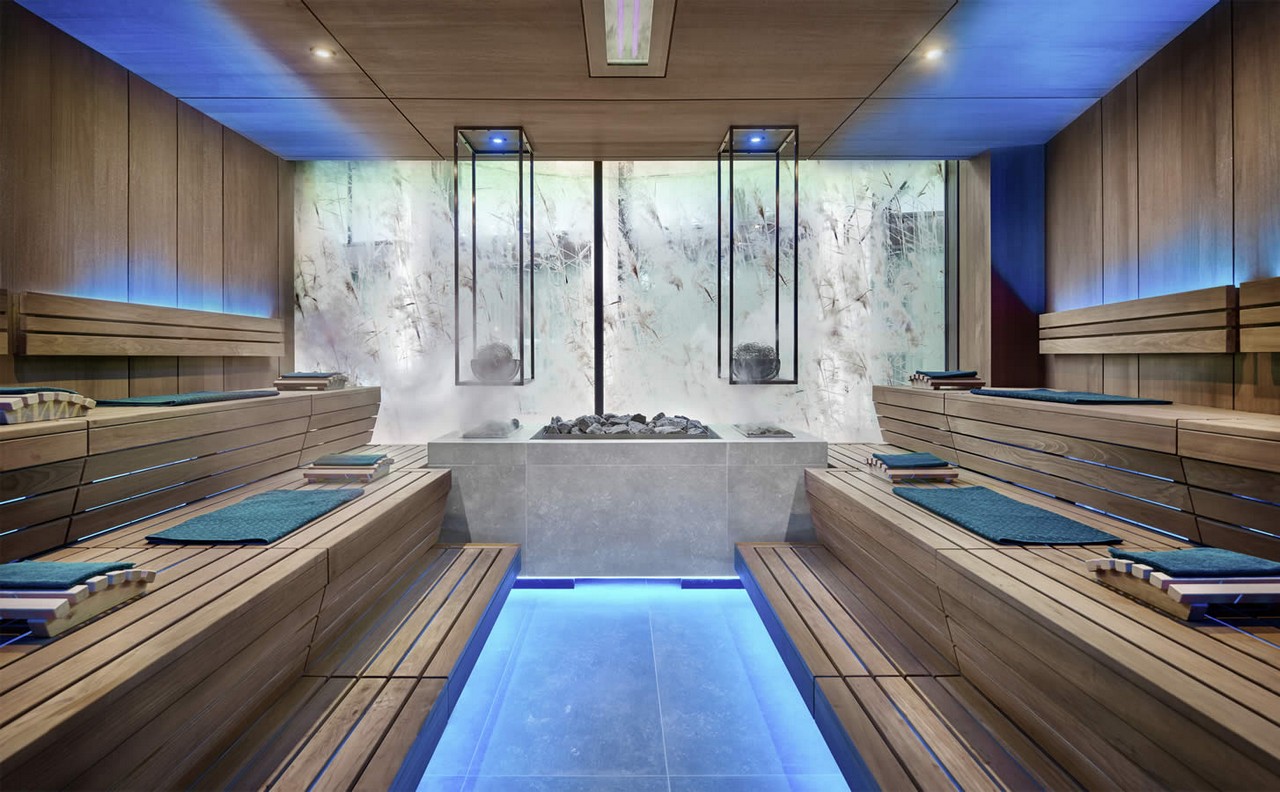
How to create a home spa. Elements to consider when choosing suitable coverings and ideas for creating space in the home.